
It shows different styles in which the button will appear to the users. Button appearance refers to the visual style and design of a button in a user interface. Buttons are a common element in software applications, websites, and mobile apps, and their appearance plays a crucial role in user experience and user interaction.
The given below image will appear when you click on the button settings.
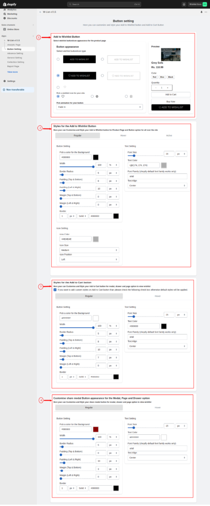
01. Add to Wishlist Button Appearance #
This portion of the Add to Wishlist button appearance can be further categorized into 5 sections as shown below in the image.
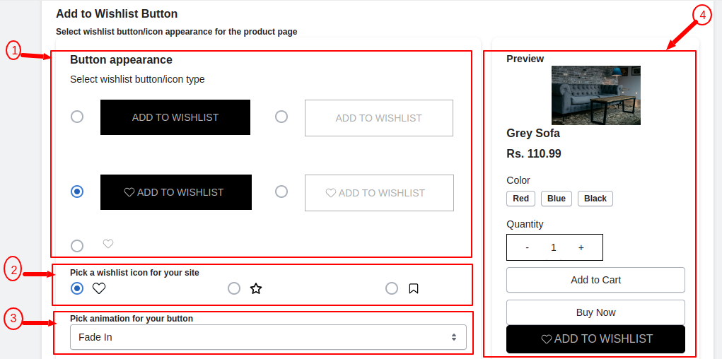
01. Button Appearance #
Customize the wishlist button’s appearance by choosing from a selection of five different styles, allowing you to tailor its visual presentation to suit your preferences or align with your website’s design.
Watch the video below to see how easy it is to customize the appearance of the “Add to Wishlist” button.
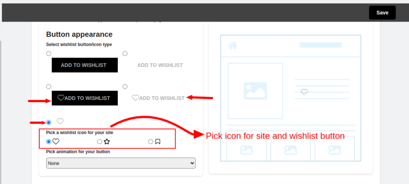
02. Pick a Wishlist icon for your site #
Personalize your experience further by selecting a star or bookmark icon, replacing the default heart icon. Choose your preferred icon from the options available in the app, as indicated in the image below.
Explore the icon customization options by referring to the instructional video provided below. The video demonstrates how to change the default heart icon to either a star or bookmark icon, enhancing the visual appeal of your experience.
03. Pick animation for your button #
Button animations can add interactivity, visual appeal, and feedback to user interface elements, making the user experience more engaging and intuitive. As shown in the video below are some common button animation options you can consider for your wishlist button:
04. Preview of the button #
Instantly preview the appearance of your button on your store in real-time within this section.
Note*- Crucially, remember to save your modifications instantly after adjusting your wishlist button. Without saving, these changes won’t reflect on your store.
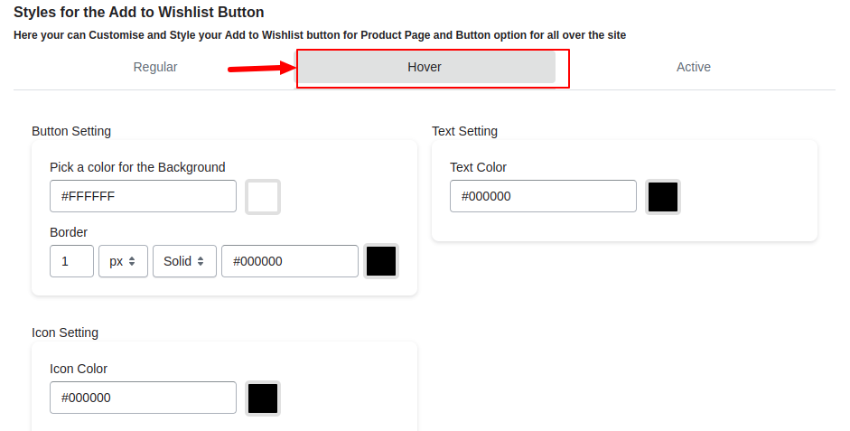
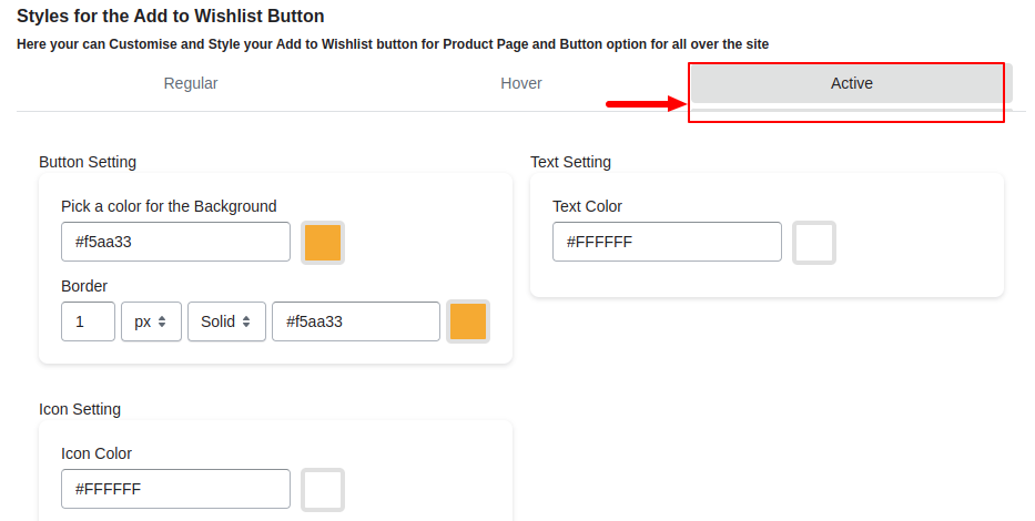
02. Styles for the Add to Wishlist Button #
The “Style Box” for a wishlist button allows you to customize various visual aspects of the button. Here’s an explanation of each of the options mentioned:
There are three types of options available i.e. Regular, Hover, and Active as shown in the image below:
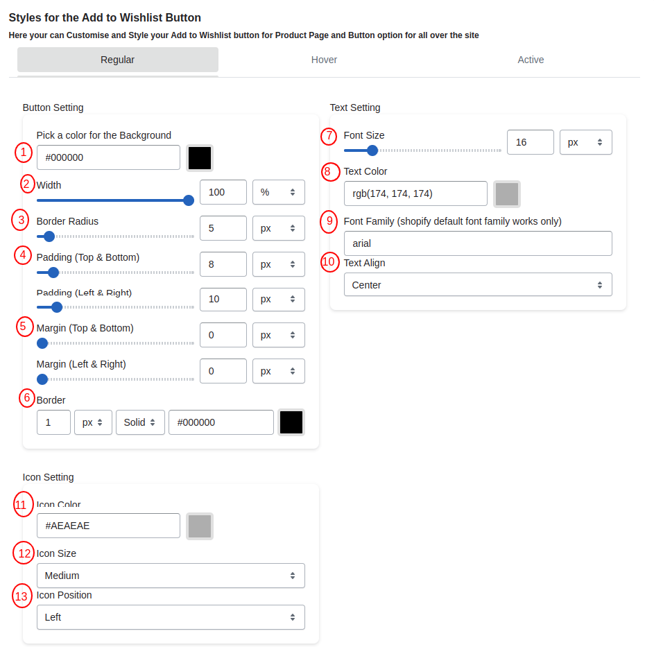
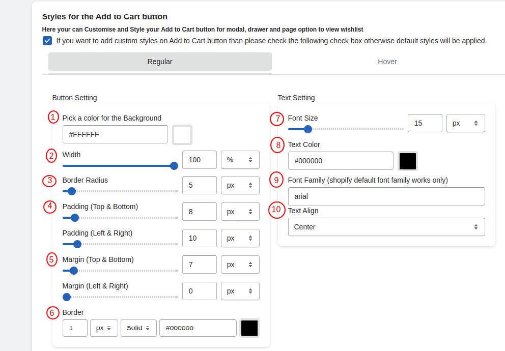
1. Background Color #
This option lets you choose the background color of the button. You can select a color that matches your website’s design or your brand’s color scheme. You can also manually input values to set the color of your desired choice.
2. Width #
You can specify the width of the button. This is useful for making the button wider or narrower to fit your layout.
3. Border Radius #
This option controls the roundness of the button’s corners. A higher value will result in more rounded corners, while a lower value will make them sharper. Further, you have four units in which you can set your size which are %, rem, em, and px.
4. Padding #
Padding determines the space between the text and the button’s edges. You can increase or decrease the padding of the top and bottom also right and left to control the button’s size and spacing.
5. Margin #
Margin sets the space between the button and surrounding elements. It defines how much empty space there should be around the button. Through this setting, you can set the margin for the top, bottom, left, and right.
6. Border #
Customize the border of the button, including options like border color, width, and style (solid, dashed, etc.). Borders can be used to add emphasis to the button.
7. Font Size #
Adjust the size of the text on the button. You can make it larger or smaller to fit your design preferences.
8. Text-Color #
You can set the text color of the Add to Wishlist button “text”.
9. Font Family #
Choose a font style for the button text that aligns with your website’s design and brand identity. Prioritize readability, maintain consistency, and ensure responsiveness across devices.
10. Text Align #
Choose how the button should be aligned within its container. You can align it to the left, center, or right, or justify it based on your design needs.
Similarly, you can also choose the styles for the hover and active options from the settings provided.
*Note- Don’t forget to click on the “Save” button ( placed on the top right corner of your screen ) after you have made changes to your wishlist button styles.
03. Add to Cart Button Styles #
Your Add to Cart Button Styles are the same as the Styles for the Add to Wishlist Button as shown in the image below. So for the settings, you can refer to Styles for the Add to Wishlist Button.
Your Add to Cart button is available on the Modal page and Drawer Page as shown in the videos below.
On the Modal page Add to Cart button looks like this as shown in the video below:
On a Separate page, it looks like as shown in the video below:
When you select UI type as drawer then it will appear like the video below:


