
- 1. Wishlist UI type (Modal, Page & Drawer)
- 2. Wishlist icon location
- 3. Notification Setting
- 4. Share wishlist setting
- 5. Language Settings
- 6. Add to Cart Settings
- 7. Choose when to send email reminders to your customer
- 8. Custom CSS
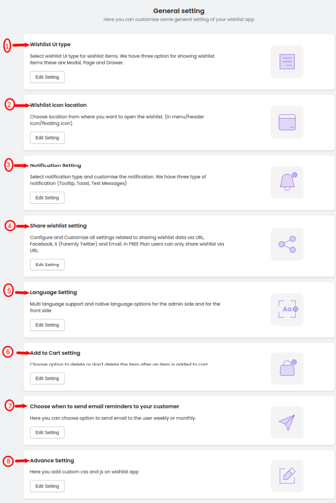
Welcome to the command center of customization – our Wishlist App’s General Settings page! Here, you wield the power to sculpt every detail of your wishlist experience, from the way it appears to users to the intricate nuances of notifications and sharing options. Dive into a world where UI types, color schemes, icon locations, and even custom code seamlessly converge, allowing you to craft a wishlist that not only fits your brand but also elevates your user engagement. This is where your vision for a personalized and dynamic wishlist experience comes to life.
Below is the image shown when you land on the General settings page.
*Note: This is the Premium plan image. Some settings need to have an upgraded plan to use them.
1. Wishlist UI type (Modal, Page & Drawer) #
Optimize your user experience by selecting the ideal Wishlist UI type from three customizable options: Modal, Separate Page, and Drawer.
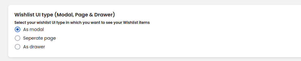
Choose the ‘Modal’ for a sleek overlay, ‘Separate Page’ for a dedicated space, or ‘Drawer’ for a discreet and space-efficient display. Tailor the appearance of your wishlist items based on your preference, enhancing your site’s overall design and functionality. For your reference below are the demo videos given that show how these functionalities work in real-time.
As a Modal: #
As a separate page: #
As a Drawer: #
Styles for the Wishlist UI type (Modal, Page & Drawer) #
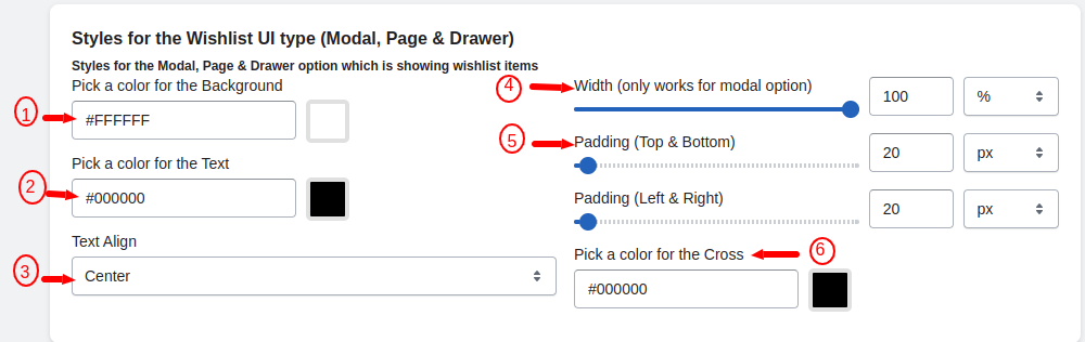
Pick a color for the Background: #
Choose a background color for your Wishlist UI, setting the tone and visual appeal of the Modal, Page, or Drawer.
Pick a color for the Text: #
Define the text color to ensure readability and cohesion with your brand, maintaining a harmonious visual balance.
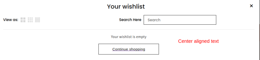
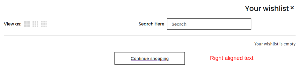
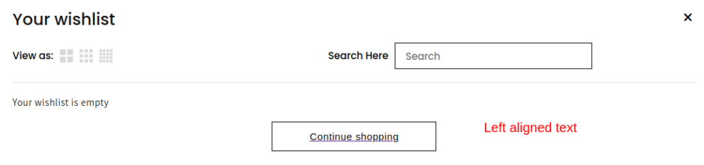
Text Align: #
Easily align your text to 3 different locations i.e. Center, Left, and Right for a visually appealing presentation, ensuring a cohesive and centered look across the Modal, Page, or Drawer UI options.
Center aligned text: #
Right-aligned text: #
Left-aligned text: #
Width (only works with the modal option): #
You can set the width in px or % for the Modal, allowing for a spacious and immersive display of wishlist items.
Padding (TOP, RIGHT, BOTTOM, LEFT): #
You can adjust the padding in 4 different units that are in %, em, rem, and px on all sides, providing consistent spacing and a well-balanced layout for a polished appearance.
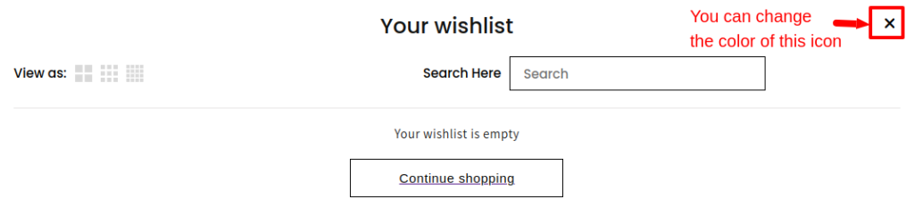
Pick a color for the Cross: #
Select a cross color for an aesthetically pleasing and cohesive look, enhancing the overall design of your Wishlist UI.
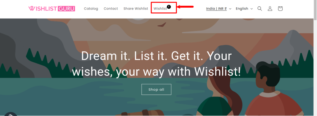
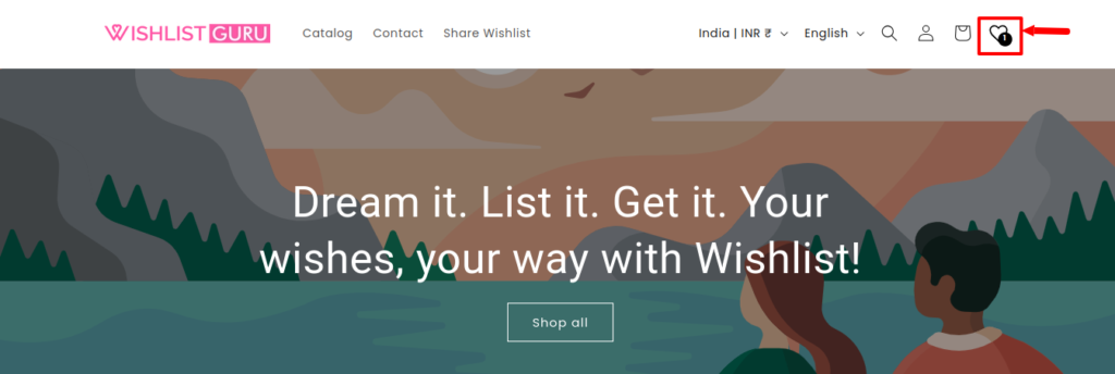
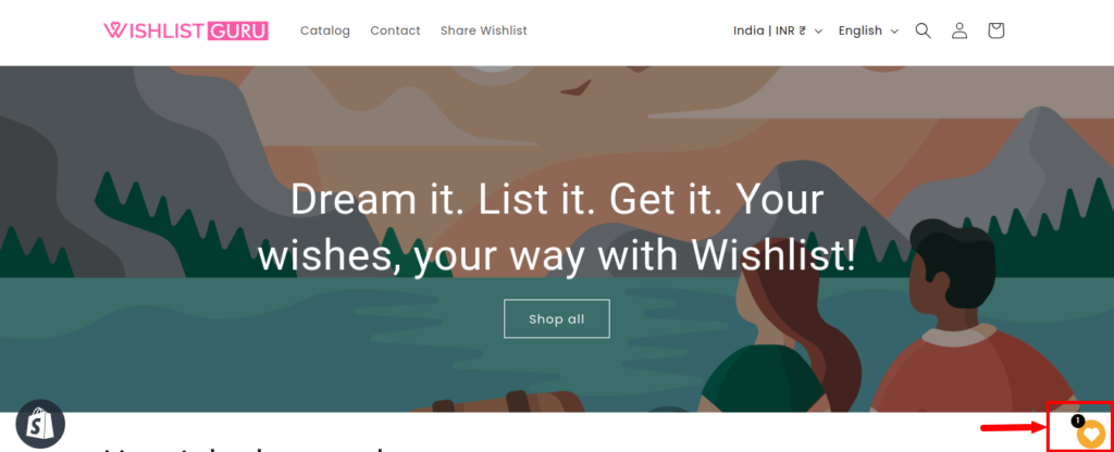
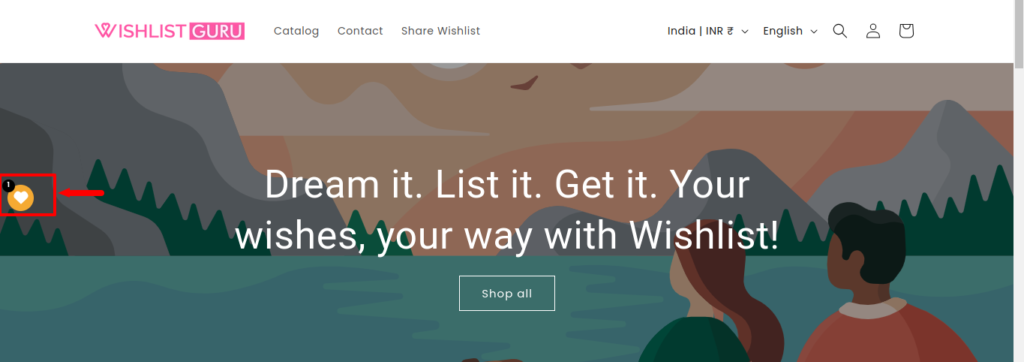
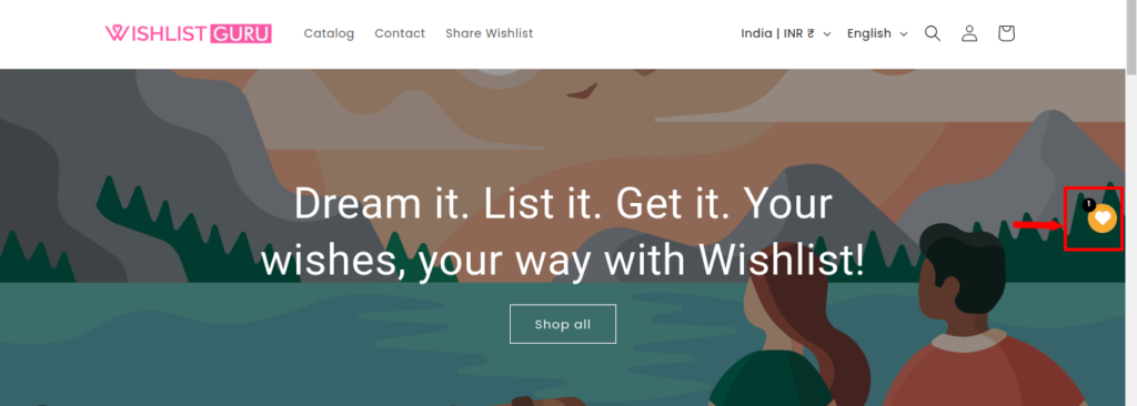
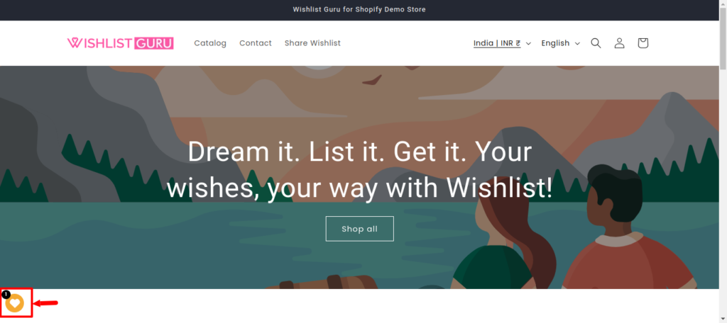
2. Wishlist icon location #
Choose the optimal location for your Wishlist icon, determining how users access their wishlist – whether as a menu item, integrated into your header as an icon, or presented as a convenient floating icon button. Tailor the placement to suit your site’s design and enhance user accessibility to the Wishlist feature.
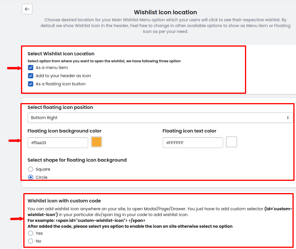
From these settings, you can choose the wishlist icon location as shown in the image below:
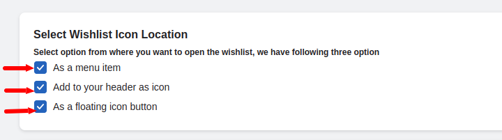
As a menu item: #
Add to your header as an icon: #
As a floating icon button: #
Opt for a dynamic user experience by selecting the type of floating icon for your Wishlist feature. Choose from options like floating icon bottom right, mid left, mid right, or bottom left, tailoring the placement to seamlessly integrate the Wishlist functionality into your site’s design.
Bottom right:
Mid-left:
Mid-right:
Bottom-left:
You can also change the floating icon’s background color, the shape of the floating icon, and the text color of the floating icon.
Wishlist icon with custom code #
You can add a wishlist icon anywhere on your store with the help of a custom code. To add the icon you need to just copy the provided code i.e. <span id=”custom-wishlist-icon”> </span> in the required div. After adding the code you need to select the “Yes” option to show the icon.
Below is the video that shows how to do it.
3. Notification Setting #
Tailor your user experience with Notification Settings, allowing you to decide what displays after adding an item to the wishlist. Choose between showcasing the Wishlist or triggering a Notification, providing flexibility to align with your site’s design and enhance user engagement.
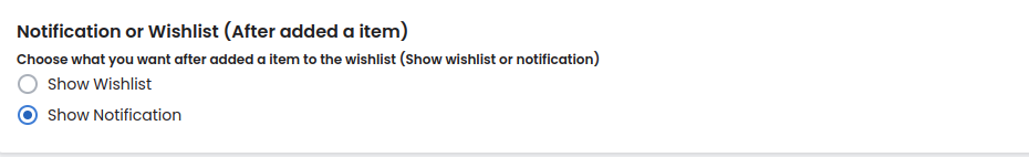
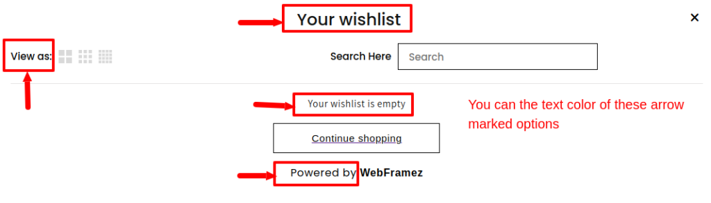
Show Wishlist: #
Show Notification: #
Notification Type: #
When we select the notification setting to Show Notification then there are 3 types of options available which are As a tooltip, As a toast, and As a text which are explained in the given link of the article below:
Article link – Click here
Styles for Notification (Tooltip, Toast & Text ) #
Customize the appearance of your wishlist notifications with the following settings as shown in the image below:
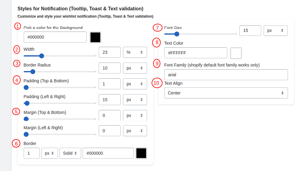
Pick a color for the Background: #
You can pick the background color of your choice for your selected notification style. Below is an example of how to do it.
Width: #
Adjust the width of the notification box in pixels, providing control over its overall size on the screen.
Border Radius: #
Customize the border-radius using pixel units for a rounded appearance. This can be adjusted separately for the top-left, top-right, bottom-right, and bottom-left corners.
Padding (TOP, RIGHT, BOTTOM, LEFT): #
Set padding values for the top, right, bottom, and left of your notification box, allowing you to control the spacing around the content.
Margin (TOP, RIGHT, BOTTOM, LEFT): #
Set margin values for the top, right, bottom, and left sides of the notification box to control its positioning.
Border: #
Define a solid border with pixel units. You can choose the border color to match your design.
Font Size: #
Adjust the font size according to your requirements and for clear visibility.
Text Color: #
Specify the text color to ensure readability and visual harmony with your overall theme.
Font Family: #
Choose a font family that aligns with Shopify’s default font options, adding consistency to your site’s typography.
Text Align: #
Align the text within the notification box either to the center, left, or right, allowing you to achieve a polished and visually appealing presentation.
4. Share wishlist setting #
In the “Share Wishlist Setting” section, administrators have the flexibility to control sharing permissions. There are two distinct options:
- Login User:
- By selecting this option, sharing the wishlist is restricted to users who are logged into their accounts. This ensures that only authenticated users have the capability to share their wishlists.
- All Users (Guest and Login Both):
- Opting for this setting allows both guest users and logged-in users to share wishlists. It opens up sharing capabilities to a broader audience, enhancing inclusivity and user engagement on the platform.
Administrators can choose the option that aligns with their platform’s strategy, balancing accessibility with user authentication for wishlist sharing.
Share Wishlist (Via Email, Facebook & X) #
In the “Share Wishlist (Via Email, Facebook & X)” settings, users have diverse sharing options, including URL, Email, Facebook, and Twitter (‘X’):
- Email Subject:
- Customize the subject line for wishlist-sharing emails. Utilize placeholders such as ##wishlist_share_email_customer_name## to dynamically replace the customer’s name.
- Email Message:
- Compose a personalized email message for customers sharing wishlists. Use placeholders like ##wishlist_share_email_customer_name## and ##wishlist_share_email_customer_message## to dynamically insert the customer’s name and message.
- Email Wishlist URL:
- Dynamically insert the customer’s wishlist page URL (##wishlist_share_email_wishlist_url##) into the email body. This URL facilitates direct access to the shared wishlist.
5. Language Settings #
These settings allow you to set the language for the user according to the requirement. For further information Click here.
6. Add to Cart Settings #
Given below is the overview of the add-to-cart settings provided in the app.
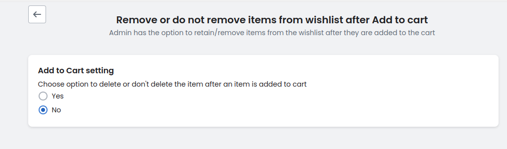
When configuring the “Add to Cart” setting, administrators can choose whether to delete or retain items from the wishlist after they’ve been added to the cart. Opting to delete items streamlines the wishlist and avoids clutter while choosing not to delete allows users to maintain a record of their desired items even after purchase. This flexibility caters to varying user preferences and enhances the overall shopping experience.
7. Choose when to send email reminders to your customer #
With the customized email options for our wishlist app, administrators can now decide when to send email reminders to customers. This feature offers flexibility by allowing administrators to choose between sending reminders on a weekly or monthly basis.
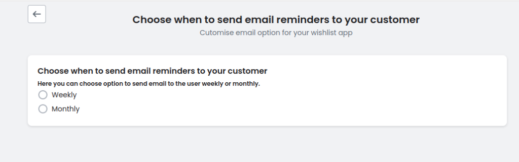
By selecting the preferred frequency, administrators can tailor their email communication strategy to best suit their customers’ preferences and optimize engagement. Whether it’s weekly updates to keep customers informed about their wishlist items or monthly summaries for a more periodic reminder, this feature empowers administrators to enhance customer engagement and satisfaction.
8. Custom CSS #
In Advanced Settings, administrators can refine site aesthetics with custom CSS using “!important” for overriding styles. JavaScript/jQuery customization allows for tailored interactions like post-addition and removal actions for wishlist items. These features offer granular control, enabling precise adjustments to site appearance and functionality. For more information about this, you can Click here.


