
Customize the Add to Wishlist button to match your store’s branding and improve user experience. This guide details how to personalize the button’s placement, style, and interaction states (hover, active) on your product pages. Easily configure placement options—beside the title, on the image, or next to the Add to Cart button—from your dashboard. Follow the instructions below and watch the video for a detailed walkthrough.
To customize the Wishlist button appearance on your store, follow the instructions given below: #
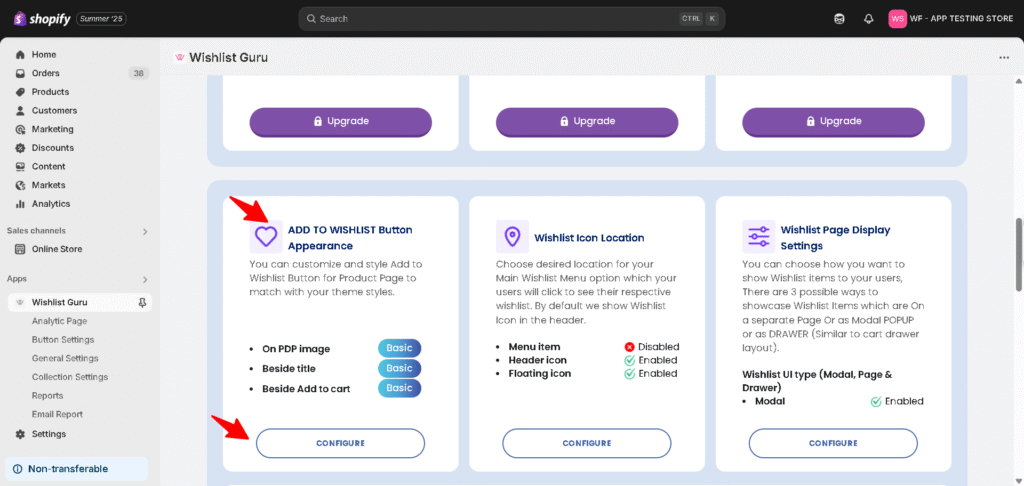
- Go to the Dashboard page
- Scroll Below and find the settings that say “Add to Wishlist Button appearance“ and then click on the Configure button.
Choose Your Add to Wishlist Button Layout #
Once the Configure panel is open, the Add to Wishlist Button section lets you pick how the button or icon should appear on your product page. Select the layout that best matches your store’s design from the following options:
- Text + Background, No Icon – a solid button displaying only the text “Add to Wishlist “
- Only Text, No Background, No Icon – plain text link style with no button background or icon
- Icon + Text + Background – a solid button with both an icon and the “Add to Wishlist ” text (default)
- Icon + Text, No Background – an icon and text combination without a button background, for a minimal look
- Icon + Background, No Text – a compact icon-only button, useful for tight layouts or mobile-first designs
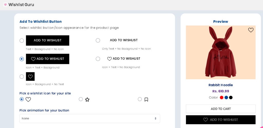
Pick a Wishlist Icon #
If your chosen layout includes an icon, you can select which icon represents the Add to Wishlist action on your storefront. Available icon options include:
- Heart
- Star
- Bookmark (default)
👉 Choose an icon that feels intuitive for a gift Wishlist — for example, a bookmark or heart icon is commonly associated with “saving” an item for later.
Pick a Button Animation #
To draw a little extra attention to the Add to Wishlist button, you can apply an animation effect that plays when the button is shown or interacted with. By default, this is set to None, but you can select an animation style from the dropdown menu to add subtle motion to the button.
👉 Animations can help highlight the Add to Wishlist option, but if you prefer a clean, distraction-free product page, leaving this set to None works well too.
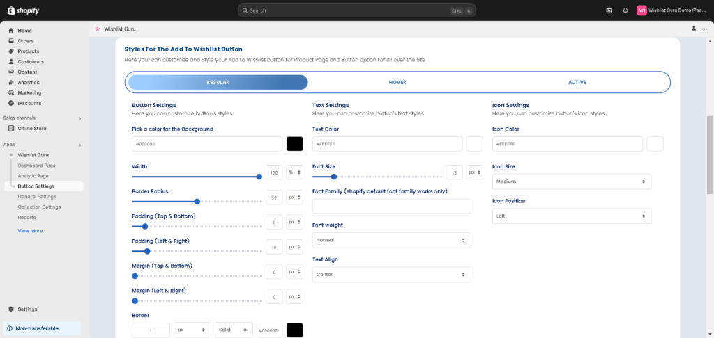
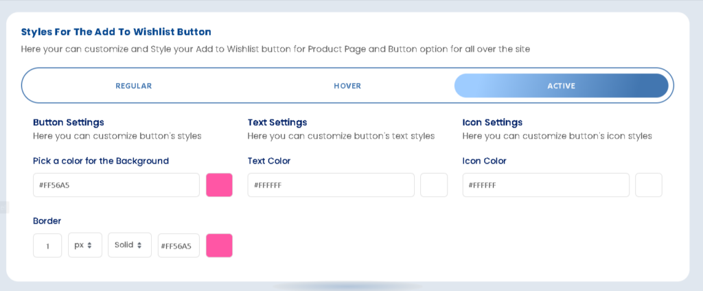
Styles your Add to Wishlist Button: #
The “Style Box” for a wishlist button allows you to customize various visual aspects of the button. Here’s an explanation of each of the options mentioned:
There are three types of options available i.e. Regular, Hover, and Active as shown in the image below:
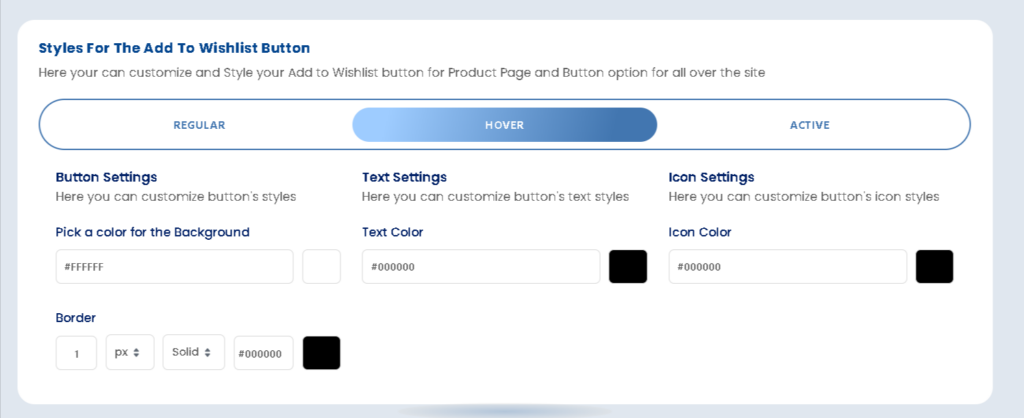
How do I customize the Wishlist Hover style on my store? #
Use the Hover tab to set how the Add to Wishlist button changes appearance when a shopper hovers over it — for example, a slightly darker background color or a subtle border change. This gives shoppers visual feedback that the button is interactive.
How do I customize the Wishlist Active style on my store? #
Use the Active tab to set how the Add to Wishlist button looks once a product has been added to the registry — for example, changing the text to “Added to Registry” along with a different background color or icon state. This reassures shoppers that the item was saved successfully.
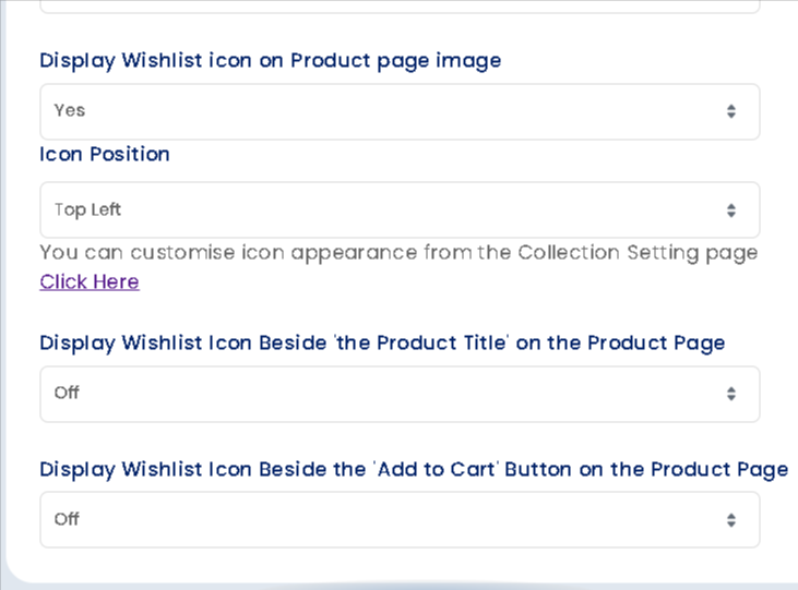
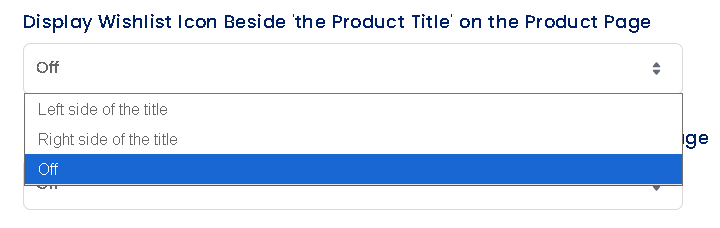
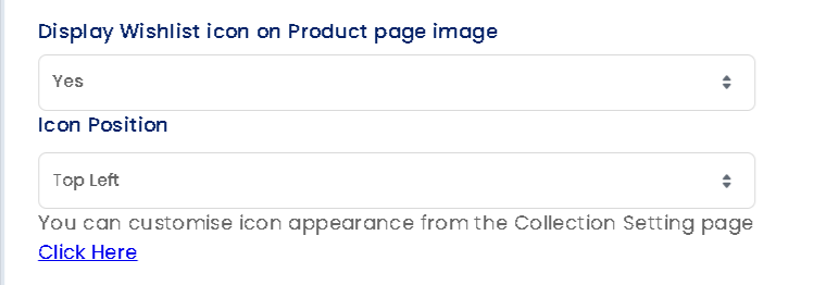
Choose Where the Button Appears #
You can show the Add to Wishlist button in the following locations on your product page:
- Product page image
- Beside the product title
- Beside the Add to Cart button
*Note- Don’t forget to click on the “Save” button ( placed on the top right corner of your screen ) after you have made changes to your wishlist button styles.
Custom CSS Styling (Basic Plan) #
How to add gradient colour to the Auto Inject Wishlist button: #
Here is the custom CSS code for the “Add to Wishlist” and “Remove from Wishlist” buttons, matching the style of the “Add to Cart” button:
/* Default button - Add to Wishlist */
.button-collection .buttonStyleHead {
  border-radius: 79px !important;
  background-image: linear-gradient(90deg, rgb(240, 41, 133), rgb(255, 145, 165)) !important;
  border: none !important;
  font-family: Arial !important;
}

/* Selected button - Remove from Wishlist */
.button-collection .alreadyButtonStyleHead {
  border-radius: 79px !important;
  background-image: linear-gradient(90deg, rgb(240, 41, 133), rgb(255, 145, 165)) !important;
  border: none !important;
  font-family: Arial !important;
}
How to add gradient colour to the Theme block Wishlist button: #
.wishlist-guru-bb .buttonStyleHead {
  border-radius: 79px !important;
  background-image: linear-gradient(90deg, rgb(240, 41, 133), rgb(255, 145, 165)) !important;
  border: none !important;
  font-family: sans-serif !important;
}

.wishlist-guru-bb .alreadyButtonStyleHead {
  border-radius: 79px !important;
  background-image: linear-gradient(90deg, rgb(240, 41, 133), rgb(255, 145, 165)) !important;
  border: none !important;
  font-family: sans-serif !important;
}


