
The notification settings in Wishlist Guru allow you to control how wishlist messages appear when customers interact with your store. You can choose to show a notification, display the wishlist directly, and customize how alerts look and behave.
With options like tooltips, toast messages, and text notifications—along with flexible styling and positioning—you can align wishlist interactions with your store’s design and improve user engagement.
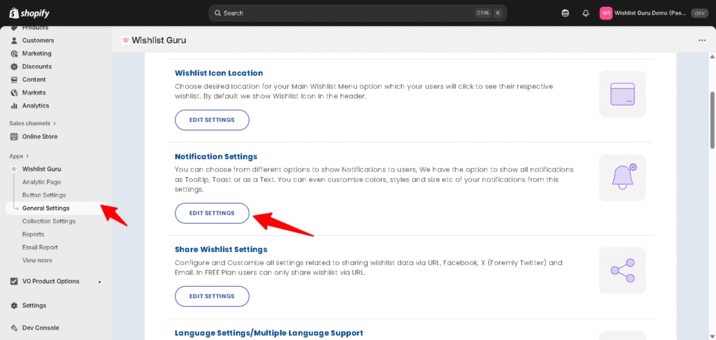
How to Configure Notification Settings in Wishlist Guru: #
- Go to General Settings
- Click on Notification Settings
- Click on the Edit settings
- Choose your preferred notification behavior
- Customize type, position, and timing
- Adjust styles and text settings
- Click Save
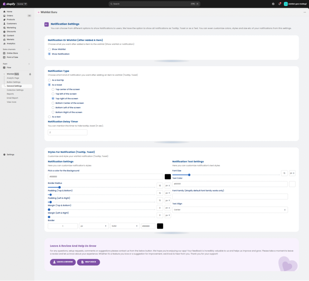
Notification or Wishlist (After Adding an Item) #
Choose what happens when a customer adds an item to the wishlist:
- Show Wishlist → Redirects or displays the wishlist
- Show Notification → Displays a confirmation message
👉 Recommended: Use Show Notification for a smoother user experience without interrupting browsing.
Notification Type #
Select how the notification appears:
- Tooltip → Small popup near the action
- Toast → Floating notification on the screen
- Text → Simple inline message
Toast Position Options #
If you select Toast, you can choose where it appears:
- Top Center
- Top Left
- Top Right
- Bottom Center
- Bottom Left
- Bottom Right
👉 Best Practice:
- Use Top Right or Bottom Right for better visibility without blocking content.
Notification Delay Timer #
Set how long the notification stays visible (in seconds).
- Example: 2 seconds (default)
👉 Tip: Keep it short (2–4 seconds) to avoid disrupting the shopping experience.
Customize Notification Styles #
You can fully match the notification design with your store branding.
Background & Layout #
- Background color
- Border radius
- Padding (top/bottom, left/right)
- Margin spacing
- Border width, style, and color
Text Customization #
- Font size
- Text color
- Font family (Shopify default supported)
- Text alignment
👉 Tip: Use high contrast colors to ensure readability.


