
Displaying the wishlist as a modal offers a quick, seamless user experience—allowing customers to view their saved items without leaving the current page, which helps reduce interruptions and increase engagement.
To show wishlist UI as a “Modal” on your store you can follow the instructions given below. #
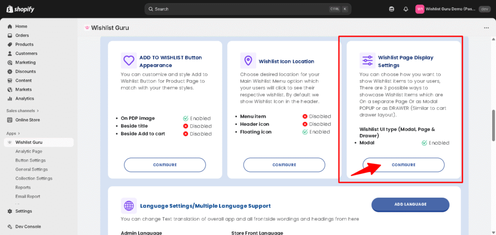
- Go to Dashboard
- Scroll below you will find section Wishlist Page Display Settings, see below
- Click on Configured
You will be directed to the section as shown in the image below of the General Settings page.
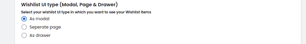
Within this section, check the radio button listed as “As a Modal”. This ensures that the Wishlist UI will be displayed as a modal when you click on the wishlist icon.
Save settings after configuring the Wishlist display options by clicking on the “Save” button (located in the top right corner) to apply the changes. Your Wishlist UI type will now be accessible as a modal.
Styling Options for Wishlist Modal, Page & Drawer #
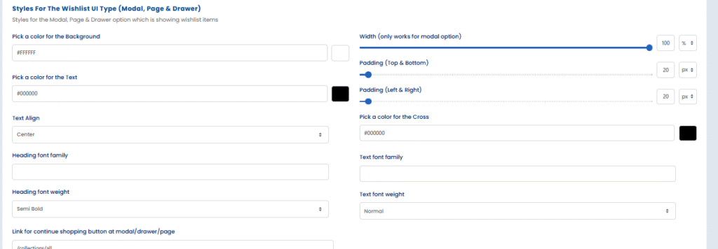
Adjust the visual appearance of your wishlist interface with the following settings:
- Background color: Set the color that appears behind all wishlist content.
- Text color: Choose the color used for general text within the wishlist.
- Text alignment: Aligns text content (left, center, or right) within the modal.
- Heading font family: Select the font style used for wishlist headings.
- Heading font weight: Define the thickness or boldness of the heading text.
- Width (for modal only): Control how wide the modal appears on the screen.
- Padding (Top & Bottom): Add space above and below the wishlist content.
- Padding (Left & Right): Add space to the left and right of the wishlist content.
- Cross icon color: Set the color for the close (X) icon on the modal.
- Text font family: Choose the font style for regular body text in the wishlist.
- Text font weight: Define how bold or light the body text should appear.
- Continue shopping button link: Specify where users are redirected when clicking “Continue Shopping.”
Wishlist Item Grid Styling (Modal/Page) #
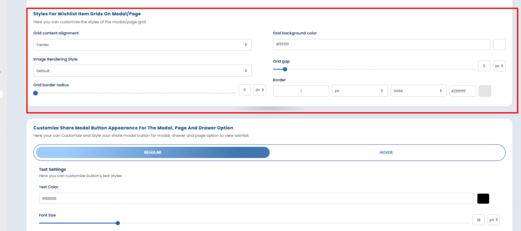
These options allow you to control how wishlist items are displayed in the modal or page layout:
- Grid content alignment: Align the content inside each wishlist item grid (e.g., center).
- Image rendering style: Choose how product images are rendered (e.g., default or smooth).
- Grid border radius: Round the corners of each grid item by setting a border radius.
- Grid background color: Set the background color of each wishlist item block.
- Grid gap: Define the spacing between each wishlist item in the grid.
- Border: Set the border width, style (e.g., solid), and color around each item grid.
Customize Share Modal Button Appearance #
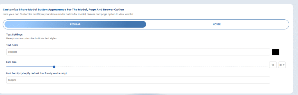
You can style the “Share Wishlist” button that appears on the modal, drawer, or page:
Regular & Hover States – Text Styling: #
- Text color: Choose the text color used in the button.
- Font size: Set how large or small the text inside the button should appear.
- Font family: Select a Shopify-supported font like Poppins for styling consistency.
Hide More Actions #
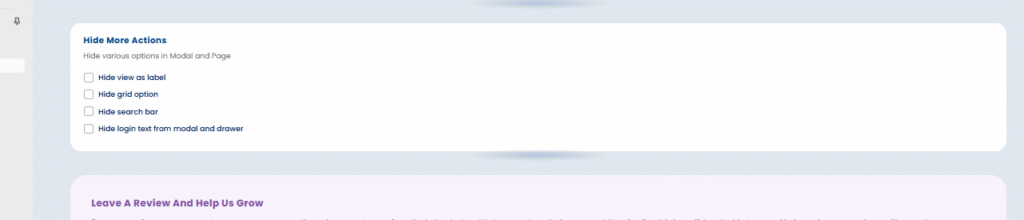
You can simplify the wishlist interface by hiding any of the following elements:
- Hide “View As” label: Removes the label that lets users change view modes.
- Hide grid option: Hides the toggle to switch between list and grid view.
- Hide search bar: Removes the search functionality from the wishlist view.
- Hide login text (in modal and drawer): Hides the text prompting users to log in.
Want to know how to do customization for Move to Cart Button ?click here


